Monday, 9 December 2013
Friday, 6 December 2013
Monday, 2 December 2013
Wednesday, 20 November 2013
Monday, 18 November 2013
Monday, 21 October 2013
Tools & Systems; Newer concepts
After doing a little bit more research on Tea and thinking more on my info-graphic concept, I came across some really interesting information and thought it was also displayed well.
It's based on how many kilograms of tea is consumed on average, per person a year. I thought it was a really good set of data and I found it even better than England was at the top (yes!).
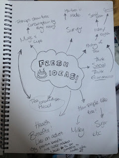
I had an idea to demonstrate this by drawing a series of mugs, each with a countries flag on it, and having the mugs differ in size & scale to show the percentage of tea consumption.
I did a quick sketch to demonstrate my latest idea;
Subscribe to:
Comments (Atom)


