Monday, 21 October 2013

Tools & Systems; Newer concepts

After doing a little bit more research on Tea and thinking more on my info-graphic concept, I came across some really interesting information and thought it was also displayed well.


It's based on how many kilograms of tea is consumed on average, per person a year. I thought it was a really good set of data and I found it even better than England was at the top (yes!).

I had an idea to demonstrate this by drawing a series of mugs, each with a countries flag on it, and having the mugs differ in size & scale to show the percentage of tea consumption. 

I did a quick sketch to demonstrate my latest idea; 


Friday, 18 October 2013

Tools & Systems; Gathering data & statistics; Other points of interest

I also found some good information on a few other subjects Im interested in, although I havent given these topics as much thought as the ones before so I probably wont use one of these ideas but I've uploaded them here for future reference just incase.


Tools & Systems; Gathering data & statistics; Embarrassing moments

I happened to stumble across this set of statistics but I thought it was really interesting. I also thought this would be a good subject to use as an opportunity to gather my own data


Tools & Systems; Gathering data & statistics; Tea

Another subject I was particularly keen on doing was tea, I thought it would make a fun info-graphic and I have a lot of ideas for it. I managed to find some statistics and information on tea consumption but only for the US. Perhaps I could gather my own data??


Tools & Systems; Gathering data & statistics - Halloween

After taking my mind map into some consideration I decided to look into a few of my points of interest. I gathered a few statistics on Halloween. I thought I would be able to get plenty of data focusing on plenty of Halloween factors. I also thought this would make for an interesting info-graphic.


Thursday, 17 October 2013

Tools & Systems; Pumpkin!

During on studio session, we were put into groups and assigned a certain subject to think up a relevant concept, collect our own data about it and find a way to display it. We were given five pounds to buy resources to create our visualisation idea. 


The group I was in was given the topic Food to create a concept on. Immediately we thought about demonstrating where ingredients in a sandwhich or other food source came from. After a bit of thought we decided this may be a little difficult as each ingredient's location isnt always listed on a sandwhich packet etc.

Finally we decided on researching where different fruits and vegetables came from around the world. We began our search at Marks and Spencers and recorded our results.


We found some really interesting countries had shipped fruit and veg here. 

Once all our data had been gathered, we decided to demonstrate our results by buying a pumpkin and using that as the Earth. We then used pins, and threads and little labels to show which fruits and vegetables had come from which countries and been shipped all the way to the UK. We used coloured threads to show which fruit or veg had been shipped, e.g; Yellow for lemons. 


After putting together our creation, we realised that we had found nor recorded no fruit or veg being shipped from places on the globe like Russia, which was an interesting thing to find.

I really enjoyed this session and thought it was massively useful! 


Wednesday, 16 October 2013

Tools & Systems; Developing ideas

After doing some more thinking on my pancake info-graphic idea I decided to sketch out a quick plan of how all the information I could use on pancakes, and all the factors that would provide me with new and different information.

This plan was sort of to get both ideas down quickly, and plan how I'd like my info-graphic to flow and lead on to each little idea.


Sunday, 6 October 2013

Tools & Systems; 3D Printing

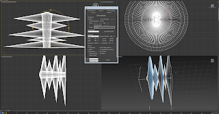
We attended a few workshops on how to create templates to 3D print as a different way of visualising information.


I found these sessions quite interesting at how information could be changed into a wide range of patterns to communicate it differently.

We converted a side profile of a face into a whole shape and considered how to 3D print with text. 

I thought these sessions were useful although at this point in the brief I dont think it will apply to any ideas I have right now. 

Saturday, 5 October 2013

Tools & Systems; My first attempt

So I made a quick illustration of one of the ideas from my mind map in hopes that Im on the right track. From looking at the Remind me video, and the other info-graphics, I thought I could perhaps go down the food or recipes road? Or I could at least give it a try until I get a better idea of what to do.


Tools & Systems; More interesting examples of info-graphics.

On my hunt I found a few more interesting examples of info-graphics. And as far as I can gather, Info-graphics are usually brightly coloured and enticing. Often portrayed as diagrams, or even tell a story on the subject. Some I have looked at even contain a slight structure to be followed throughout the illustration as to follow the 'story' or 'narrative' correctly.


Tools & Systems; Coding.

We attended a few sessions of coding and processing information. This consisted of inputting certain pieces of information in a certain order and the programme will generate a visual result of your coding.


I didnt particularly enjoy coding or find it relevant to any of the ideas I had, I didnt enjoy it as a session but Im glad that I've at least been shown how to do it. 

Friday, 4 October 2013

Tools & Systems; Useful site for info-graphics.

I decided to have a more in depth look at info-graphics to try and inspire a few more solid ideas for the brief. I came across this site which I thought was quite useful. Many of its content manages to display information, in an easy way, with light heartedness and humour still intact. 

http://visual.ly/


Here are a few examples. I particularly like the bottom one on 'The Psychology Of Abandonment' and how it shows the percentage of when people usually abandon a book by using illustrations of books on a shelf to show the numeric information as if it were a graph. 

Tools and systems; Influential video

We were shown a video as an example of info-graphics, I found it really helpful and it gave me a better idea as to some things I could use for this brief.

http://www.youtube.com/watch?v=1Xhdy9zBEws


I took some screenshots of the video of particular scenes and illustrations that I thought were useful and demonstrated a good idea of info-graphics. 

Thursday, 3 October 2013

Tools and systems; Tools in use

After a Tools and Systems session, we were told to photograph our 'Tools' we had on us and what we would be using for the session that day


Tools & Systems; Mind mapping.

Im so confused about this brief! Im not really sure what is it Im supposed to be doing..

Still, when in doubt, I will mind map my ideas and see where my mind takes me.