Thursday 31 January 2013

Sketching out my concept

I have drawn some sketches of my idea of a box and a sleeve.


I intend to have a box, with a decorative backdrop & a plain white sleeve.
The sleeve will have my design printed on one side, for instance a design similar to the drawing I posted up a few posts earlier (the pin up girl sketch) but with the outfit cut out, to reveal the decorative background of the box behind. 
When the sleeve is lifted off, my logo will be underneath. 


Deciding on a theme for my work


So having sketched out a good example of what I'd like to be my final idea, yet I still need a theme.
I know roughly that I want to go with Fashion Illustration; This is something I enjoy doing and hope to take further as my career progresses, this would also include drawing people, women especially, in general.

I'd maybe like my theme to be on pin up girls. I tend to draw a lot of pin up girls.

I have done a drawing of an idea of something I'd like to be included on my packaging. 


The dress would be cut away from the sleeve, and the background of the main box would probably be leaopard print or something like that. 


Developing my ideas further


 I have been sketching out some examples of ideas I have been having. I hit a little bit of a dead end so I decided to have a look at some more packaging ideas. 
I have a fairly strong idea of the direction and the look I would like to give to my piece, although I am perfectly aware that a little developement can only be beneficial. 

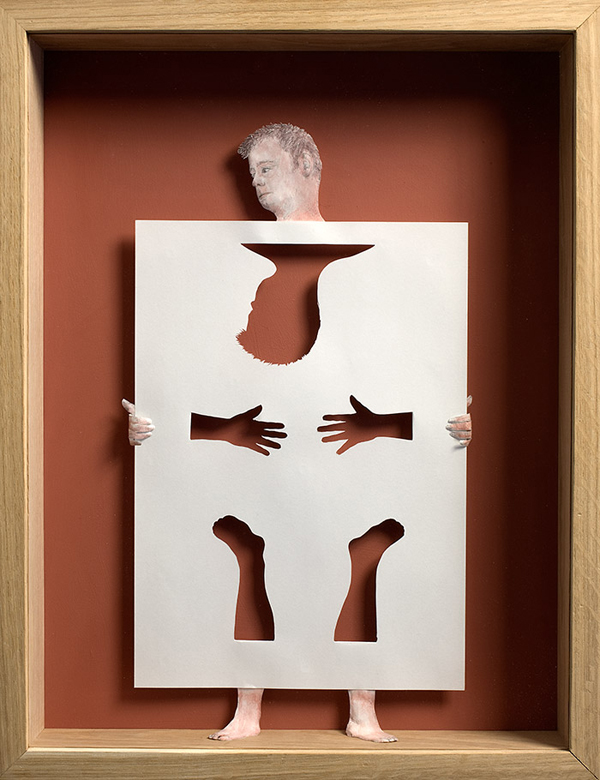
I have decided to go with negative space. I will draw a figure, as thisa is the topic I would like to focus on, and where the main focus should be (the dress), I will cut out of the design, this piece will then be layered onto a backdrop of patterned paper on another structure, a box for example.

I have done a few sketches in my sketchbook to demonstrate my ideas of negative space, however I think I'd like to change it to a more efficient concept.

I recently found a design company called "Jjaakk Design".
This company have designed bubblegum boxes, which I found quite interesting in context to my idea.


Fairly simple, coloured boxes, with cute designs of faces on the front.

Although these boxes have a sleeve, which when lifted, reveals a new design on the box. I think this is such a simple, yet a brilliantly effective idea.


I like the idea of having the flexibility of having several potential designs on a small space. I think this will be a brilliant idea to have one of my designs on the sleeve, and the cut out feature on the sleeve still showing through to the patterns box backdrop. 

Saturday 26 January 2013

A perfect example!

I understand my ability to clearly explain my concept of negative space within my design leaves a lot to be desired and the portrayal of the idea in general may be a little fuzzy.
However, casually flicking through a magazine, I spotted an advertisement for a Samsung Galaxy Note which demonstrates my idea perfectly!


On my packaging, the outfit, although I intend for it to be the main focus, wouldn't be there. 
I'd like for this design to leave a lot to the imagination of potential employers. So although the outfit would be the main focus, the concept of the outfit itself not actually being there and being physically cut away from the design could suggest a sense of diversity and 'open-ness' (I'm aware this isn't a word) to my designing and my work. 


Friday 25 January 2013

Sketching out ideas

I like the idea of cutting away designs and embracing negative space.
Many of the artists and designers I have looked at have cut away designs into their work, and use negative space which I think gives the piece a bit more. 
I have sketched out an idea on how I would incorporate my design and negative space.


This idea was spurred by the 2nd image in the "Influencing my ideas" post. 
I like the idea of a deep frame, with a decorative interior. I would then insert a cardboard slot with my design printed onto it. The design would consist of a figure, with the outfit cut out, leaving a blank space in the design. 
When assembled the background of the box would then show through the hole in the design where the outfit should be. 

Thursday 24 January 2013

Ingrid Siliakus

I found another designer called Ingrid Siliakus. 

I was really interested in this designers work and looking at just how intricate the designs are. 

Just like Su Blackwell, Ingrid has used light to enhance the three dimensonal concept of the designs. Shadows have been created in and around the structures 
The designs are really fascinating that have been cut into the rings and layers of paper. 
I would love to try something like this for my idea but Im not sure where I would put my logo on something like this. 

Wednesday 23 January 2013

Jolis Paons

I found a piece of paper art by an artist called Jolis Paons.

I think it's brilliant, and fairly relevant for the direction I'd like to take my project in.


I am absolutely in love with this piece! 
I love the texture and almost busy pattern created by the Newspaper print. And how the artist has expereimented with texture, by creasing, layers and folding to create different textures and effects, like frills on the bottom of the dress or a stiff collar. 

I really love this idea, and I would love to try something like this if the brief was relevant enough. 

Tuesday 22 January 2013

Influencing my ideas


I have recently felt at a loss with ideas. I know roughly which direction I'd like to go in and how I would like to portray myself as a designer and a similar audience.

I am looking to go with a Fashion Illustration look, as I really enjoy focusing my work on people, women in particular, and fashion. I daresay even just the joy of drawing different characters.
I have taken influence from artists I have previously mentioned, although I did not have any striking ideas. At a loss I have decided to research a little bit more into three dimensional paper structures, as I did not like the idea of going with 'nets' or 'packaging'. I thought maybe I could put a more personal spin on things.


This design reminds me of a pop up book. Although the base itself doesn't look like it's paper, I thought if I tried something like this, I could adapt it. 
I'd really like to try this out, and have numerous layers, all could be different parts of a woman's outfit, i.e a dress, scarf and shoes. When pulled apart, all the components are visible as individual garments, then when put together, the components would be combined and create a full outfit. 
I am under no impression that this won't be a tricky idea to try and put together accuratley, but I will be willing to try as I think this is a really good way to portray myself as a designer in the area I'd ideally like to be seen in. 


This piece was also particularly inspiring to my when it came to giving me ideas. I thought I could have a layour similar to this, and have a drawn character onto a seperate layer, similar to this except the paper would be secured to the bottom and not 'held' by a feature. I would cut a dress shape within the character, I would then insert a sheet of coloured, patterned or floral paper below the character and dress shaped hole, then there would be an illusion of the paper below being the dress's pattern.

I will draw out these two ideas in my sketch book and see if I can create a mini prototype of them. 

Su Blackwell

I found Su Blackwell's work really interesting. 
Not only has she made incredible images and structures in paper, it's been done with pages of a book.


Maybe it's just me, but the scenes the designer has created remind me of story book scenes, like forests and cottages. The text on the trees and other structures really adds a brilliant texture. The fact that the structures are erected from an open book aswell really adds quite a fantasised look to the pieces. 

Out of all the artists I have studied so far, Su is the first one to use lighting to enhance the atmosphere of her piece. Although lighting need not be used in my project, I really love just how much more of an effect it has on the pieces. 

Yulia Brodskaya

I thought this designer's works within paper were really interesting. 
Very simple, yet really effective, once again, like Jen Stark, by use of colour. 

This designer tends to focus on floral, swirly designs by rolling the paper in tight or loose little curls.


I love the use of colour, and how each feauture has it's own theme of colours. The designs themselves look really fragile and delicate. I love how floral and feminine they all look. 
The middle image is by far my favourite design of the three, I think it's such an effective method of using paper, yet it's fairly simple. While the designs are flat against paper, they still possess a three dimensional characteristic as the paper is stood up in little curls. 

I thought it was really interesting how the designer encorperated typography in the same way. All the while it's still really clear and readable. This may be something I could consider when it comes to my typography.

I really love Yulia's work.

Sher Christopher

Within my research, I have seen a few examples of artists and designers replicating figures and faces out of paper, which is something that I would ideally like to do.
This artist, Sher Christopher, however, really stood out to me. 


I think the way the artists has given the figures certain features is really impressive. I love the poses and accuracy the artist has captured within the pieces. 
I really love how the clothes have been made as well, with the tassles and on women's dress and the shorts in the middle picture.

I think this is a really interesting spin on creating people out of paper. 

Monday 21 January 2013

Four words?


So I've drawn up a quick spider diagram on the kind of things I am aiming to communicate and any ideas I'd like to use for my project. I never really like writing about myself so I had a little trouble. 

Brett Dettmer


I found another artist who works within paper, except the paper is still in books. Brett Dettmer's work is   a bit of a leap from the previous artists I have studied; while his pieces are still three dimensional structures, the paper hasn't been folded or scored in anyway, the imagery has been cut and carved into the text in books. 


I found these two examples of Brett's work. These particular pieces rely heavily on the layers of the pages, and I think it really adds to the image itself. I love how certain words have been separated and singled out, perhaps to enhance the message within the piece. 
I would love to try something like this, although Im not entirely sure if this would be accepted within the brief.  

Bovey Lee


Another artist I have been looking into is a women from Hong Kong called Bovey Lee, and some of her works as a paper artist have particularly inspired me. Some of the pieces I have studied all seem to have intricate an complex design.


I love the great amount of detail that Bovey puts into her pieces, the patterns and fillings of the shapes are brilliant! I also love the shadows in the background of the pieces, it really adds a three dimensional effect. The three colours of the grey background, white paper and black shadows show incredibly simplicity and keep focus of the imagery itself. 

Elsa Mora


Elsa Mora is an artist from Cuba, now based is Los Angeles. She works within numerous medias, but her work with paper has particularly caught my eye. I have studied Elsa's work in other media, and all of her paper cutting pieces reflect her as a practitioner brilliantly. Many of her cuttings have tiny, delicate and complex designs, just like in many of her other pieces.  


This is my favourite piece of Elsa's. I have been giving some thought into how I'd like to portray myself as a designer, and in what area of work. I really like fashion illustration, so in an ideal world, I would love to be able to make something simliar to this, which is why I included this example in my blog. Perhaps I wil just experiment with the textures of the dress and hair. As well as the textures, I also find the colours very effective, and really bring out certain elements in the piece.


Another instance of a fashion orientated paper cutting of Elsa's. This looks to me like a close up of a wedding dress or maybe a gown. I really love how Elsa has combined both fashion and elements of nature into one piece. This is an idea that I would like to give a try as both topics are something I do enjoy drawing from time to time. I think to try piece with this idea in mind would be quite a successful attempt at reflecting myself as a designer I'd like to be known as. 


Again, Elsa has based this piece on nature and it's forms. I love the detail that has been put into the wings and the head of this piece.


While the pieces featured above aren't particularly 3D, I thought it was incredible just to look at the detail and delicacy of the designs. I think the patterns and carefully cut features are really beautiful! And anybody looking at Elsa's work for the first time, can quickly get a clear idea of just what to expect from her other works as she as accurately conveyed her style from her multiple media's brilliantly into paper cutting. 


I have noticed that many of Elsa's works (both featured above and other works I have studied) are fairly people based, or fashion based. I have included a number of examples of her work because she seems to revolve around similar topics as I tend to and have done in the past. I think this piece is beautiful. It's enhanced by the fact that it is made from paper. It's impressively accurate, and I love the accent of nature included once again, as the artist has included vines, flowers and dragon flies within the piece. All with a, seemingly signature, complex pattern. 

I think Elsa'a work is incredibly inspiring, and I will more than likely be referring back to her once again when it comes to experimenting with my own paper cuttings.

Sunday 20 January 2013

Jen Stark

 I found another designer whose work I found particularly interesting. 

While the designer's works are fairly shape based and geometrical, she enhances them by using bright and vibrant colour. 


I think these pieces are beautiful. 
And although they are fairly geometric and square, I love how they still resemble huge flowers and petals. 
I also think the layering of the material is really interesting. 


Friday 18 January 2013

Peter Callesen


Since leaving one of the paper sculpture workshops recently, I have been inspired to look into artists who work with paper, making sculptures and forms using just that. 


My first stop within my research was an artist from Copenhagen called Peter  Callesen. I studied a number of his pieces and works, and I was amazed at the accuracy and attention to detail he has paid within each of his works


I thought that this particular piece was very clever, and a really simple reference toward the media he had worked in. The fact that the bird form is still attached to the paper it was cut from presents a very subtle hint of almost being brought to life, and captures the bird in flight at it's freeest form.
.


The detail in this picture on the skull is incredible. Im aware that while this is inspirational, it would be foolish of me to aspire to such perfection and detail in one of my pieces.


Another instance of cutting as form out of the paper and leaving it attached. I think this is a really effective method.


I really love this piece. It's really inspired me to try some cut out work, myself.


One idea I have for my own project is to base it on the human form & people, as this is a direction I really enjoy working in. Although I don't intend to feature anything as complex as a skeleton in my project I thought this piece was interesting and could perhaps serve as some inspirational use.


In conclusion, I have found Callesen's work to be extremely inspirational and I intend to try out some of his methods and ideas for myself..