I thought this designer's works within paper were really interesting.
Very simple, yet really effective, once again, like Jen Stark, by use of colour.
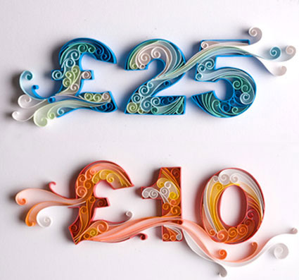
This designer tends to focus on floral, swirly designs by rolling the paper in tight or loose little curls.


I love the use of colour, and how each feauture has it's own theme of colours. The designs themselves look really fragile and delicate. I love how floral and feminine they all look.
The middle image is by far my favourite design of the three, I think it's such an effective method of using paper, yet it's fairly simple. While the designs are flat against paper, they still possess a three dimensional characteristic as the paper is stood up in little curls.
I thought it was really interesting how the designer encorperated typography in the same way. All the while it's still really clear and readable. This may be something I could consider when it comes to my typography.
I really love Yulia's work.
No comments:
Post a Comment