Wednesday, 20 February 2013
Monday, 18 February 2013
Collections from Castle Market; Postcards & Stamps
I also purchased some used Postcards and stamps from a stall on the top floor of the market.
I bought some that were already written on with messages and addresses, I think these will go really well in my Zine.
I really love the handwriting on this postcard. It looks really old fashioned and 'classy' in a way. The fact that it is addressed to somebody in Sheffield would make it all the more relavent for my Castle Market Zine.
This particular postcard caught my eye. Although it's not really fitting with the 'Scrapbook' type theme Im trying to go for with the postcards, buttons & stamps, I thought it might be a nice feature to stand out in my Zine.
Saturday, 16 February 2013
Collections from Castle Market; Buttons & Lace
After a few visits, and sketching, I have decided to start buying things with each visit.
I have bought some buttons and some lace with intent to use some of them in my Zine.
Wednesday, 13 February 2013
Looking at Zines
Since being assigned our new brief, I have been looking into Zines.
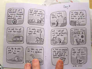
I had never heard of zines up until now but from what I can gather, they're almost like short playful comics. Or more illustrative, less informative magazines, pamphlets or booklets.
The line above is called 7 days in Berlin, by Neil Slorance.
I really like how simple and almost minimal the front cover is, and the same almost goes for the inside. Colour is kept in grayscale and the illustration is fairly simple (although this may just be the artists style of work, and have nothing to do with the context of the zine itself.)
Here are a few more examples of some Zines I found. So far, I am really liking the concept of Zines as many of them seem to be very illustrative and look very personalised to the author.
The front coves of the zines I have looked at all seemed to feature a simple Illustration regarding the subject of the zine. Perhaps when I get to designing my front cover, I should just pick out one of my sketches?
I love the layouts of the contents in these examples. Very minimal, not too cluttered. It almost gives the Illustrations and features inside room to breathe and be properly admired from page to page.
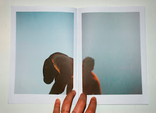
I am also considering using photographs that I take too. I love this example of splitting a single photo over two pages, even with a white border.
I am noticing a pattern of lack of text, and even when text is featured, it's more often than not hand drawn.
I like the lack of text, and the concept of letting images speak for themselves, without captions or explanations.
Sunday, 3 February 2013
Finalising my logo
So here is my final logo. I went with the handwritten & signature look. I really like the bold contrast of black against white. I thought I would enhance with by adding a white border around the black circle.
Creating my box template
While looking for suitable box nets, I found a website which creates a net for you when given the measurements.
(http://www.ideogram.nl/boxmaker/)
I thought this was massively useful as now I know that my net will be my own measurements and my own decision, yet it will be accurately measured and won't be open to mistakes of being measured in-accurately.
I know the shape I want my box to be, so with a ruler I have roughly estimated the measurements.
I want the box to be tall enough & wide enough to have plenty of space to clearly display my design on the sleeve, and also to have space for my logo. Although I didn't want my box too big, I wanted it to be fairly small, and chunky.
I chose 2 sets of measurements;
Width: 9cm
Height: 17cm
Length: 5cm
-------------------
Width: 10cm
Height: 17cm
Length: 7cm
Here are some screen shots of the templates I have made;
I will assemble these and see which structure is best.
Potential logo designs
So I scrubbed up the line work of some of my examples and decided to have a quick experiment with them on Illustrator.
These are just 4 variations but I intend to do some more.
I really like this them. I especially like the bottom example.
Although I have gone for the handwritten look in my logo, it almost reminds me of a stamp or or sticker, or maybe even a badge?
Putting my net together
I've decided on a background now, and I am putting together my sleeve and the net & arranging where my logo and model will go.
A screenshot of my sleeve that I have measured out. I decided to have my logo on one side of box and my design on the other. I have measured my sleeve going on my measurements on the box. The dress on the pin up girl is black, because I will be cutting this out so I needn't have any detailing on it.
I have applied to background to my box template, and again, I have applied my logo; One large one which will go on the opposite side to my pin up girl design, and one small one, which when the sleeve is lifted off, will be revealed.
Saturday, 2 February 2013
Deciding on a logo
I scanned in a few examples of some logos I'd sketched out, the ones that looked most promising to use and were most pleasing to me.
I decided after looking at other logo's that I was going to go with a signature and hand written kind of look.
I'm going to scrub some of these examples up in Illustrator and see which looks best.
Stealing some style inspiration..
I've collected some images that I could use as some reference for fashion and hair style etc.
I really like the pose & outfit on this picture
I love the neckline to this dress, dependant on the perspective of the design I draw, I'd like to use a neckline like this in my outfit (although it will be cut out, but at least the neckline shape will be visible)
I also love the Victory Roll's hairstyle on this model, I may try and use this on my design.
I thought this compilation was really useful as there's multiple outfits, hairstyles and poses I could perhaps take some reference from to ensure that my pin up girl style is as accurate as possible.
I love this style of dress and how the length is fairly cheeky & short. This is quite a popular pose and style, when the dress rides up and shows 'a little too much' almost. I think this concept is fairly cheeky and playful without being interpreted as something more smutty or inappropriate.
Subscribe to:
Comments (Atom)


