Since being assigned our new brief, I have been looking into Zines.
I had never heard of zines up until now but from what I can gather, they're almost like short playful comics. Or more illustrative, less informative magazines, pamphlets or booklets.
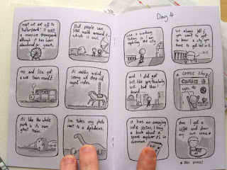
The line above is called 7 days in Berlin, by Neil Slorance.
I really like how simple and almost minimal the front cover is, and the same almost goes for the inside. Colour is kept in grayscale and the illustration is fairly simple (although this may just be the artists style of work, and have nothing to do with the context of the zine itself.)
Here are a few more examples of some Zines I found. So far, I am really liking the concept of Zines as many of them seem to be very illustrative and look very personalised to the author.
The front coves of the zines I have looked at all seemed to feature a simple Illustration regarding the subject of the zine. Perhaps when I get to designing my front cover, I should just pick out one of my sketches?
I love the layouts of the contents in these examples. Very minimal, not too cluttered. It almost gives the Illustrations and features inside room to breathe and be properly admired from page to page.
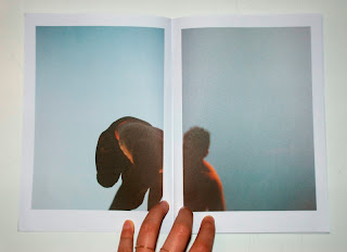
I am also considering using photographs that I take too. I love this example of splitting a single photo over two pages, even with a white border.
I am noticing a pattern of lack of text, and even when text is featured, it's more often than not hand drawn.
I like the lack of text, and the concept of letting images speak for themselves, without captions or explanations.


No comments:
Post a Comment